body.page-id-10480 .fs-generic-page {
background: #f8fafc;
padding-top: 44px;
padding-bottom: 72px;
}
body.page-id-10480 .fs-generic-page > .container {
max-width: 1240px !important;
padding-left: 28px;
padding-right: 28px;
}
@media (max-width: 700px) {
body.page-id-10480 .fs-generic-page {
padding-top: 28px;
padding-bottom: 48px;
}
body.page-id-10480 .fs-generic-page > .container {
padding-left: 18px;
padding-right: 18px;
}
}
@media (max-width: 600px) {
.profile-banner-card {
padding: 28px 18px;
}
.profile-photo-wrapper {
width: 180px;
height: 180px;
}
.author-name {
font-size: 30px;
}
.banner-buttons {
width: 100%;
flex-direction: column;
}
.btn-banner {
width: 100%;
justify-content: center;
}
.article-card {
padding: 22px;
}
}
body.page-id-10480 .fs-author-profile {
–primary: #004892; /* Foresmart Deep Blue */
–primary-light: #e6f0fa;
–secondary: #00a4e4; /* Foresmart Cyan */
–secondary-light: #e6f6fc;
–success: #00d084; /* Verified green */
–success-light: #e6faf3;
–neutral-dark: #0f172a;
–neutral-muted: #475569;
–neutral-light: #f8fafc;
–border-color: #e2e8f0;
–shadow-sm: 0 1px 3px rgba(0,0,0,0.05);
–shadow-md: 0 4px 6px -1px rgba(0,0,0,0.05), 0 2px 4px -1px rgba(0,0,0,0.02);
–shadow-lg: 0 10px 15px -3px rgba(0,0,0,0.05), 0 4px 6px -2px rgba(0,0,0,0.02);
–radius-sm: 6px;
–radius-md: 12px;
–radius-lg: 16px;
–font-sans: ‘Inter’, -apple-system, BlinkMacSystemFont, “Segoe UI”, Roboto, Helvetica, Arial, sans-serif;
–transition: all 0.3s cubic-bezier(0.4, 0, 0.2, 1);
}
:where(.fs-author-profile, .fs-author-profile *) {
box-sizing: border-box;
margin: 0;
padding: 0;
}
body.page-id-10480 .fs-author-profile {
font-family: var(–font-sans);
color: var(–neutral-dark);
line-height: 1.5;
-webkit-font-smoothing: antialiased;
}
body.page-id-10480 .fs-author-profile {
width: 100%;
max-width: none;
margin: 0 auto;
padding: 0;
}
/* — PROFILE BANNER CARD — */
.profile-banner-card {
background-color: #ffffff;
border: 1px solid var(–border-color);
border-radius: var(–radius-lg);
padding: 40px;
box-shadow: var(–shadow-md);
margin-bottom: 24px;
position: relative;
overflow: hidden;
display: grid;
grid-template-columns: 240px 1fr;
gap: 40px;
}
/* Gradient top border accent */
.profile-banner-card::before {
content: ”;
position: absolute;
top: 0;
left: 0;
right: 0;
height: 6px;
background: linear-gradient(90deg, var(–primary), var(–secondary), var(–success));
}
/* Left column: Photo */
.photo-container {
display: flex;
flex-direction: column;
align-items: center;
gap: 16px;
}
.profile-photo-wrapper {
width: 220px;
height: 220px;
border-radius: var(–radius-md);
border: 1px solid var(–border-color);
overflow: hidden;
background-color: var(–neutral-light);
box-shadow: var(–shadow-sm);
}
.profile-photo {
width: 100%;
height: 100%;
object-fit: cover;
}
.photo-verified-badge {
display: flex;
align-items: center;
justify-content: center;
gap: 6px;
font-size: 11px;
font-weight: 600;
color: var(–neutral-muted);
background-color: var(–neutral-light);
padding: 6px 16px;
border-radius: 20px;
border: 1px solid var(–border-color);
width: 100%;
text-align: center;
}
.photo-verified-badge svg {
width: 12px;
height: 12px;
fill: var(–success);
}
/* Right column: Info */
.profile-info {
display: flex;
flex-direction: column;
justify-content: center;
}
.author-name {
font-size: 36px;
font-weight: 800;
letter-spacing: -0.75px;
color: var(–neutral-dark);
margin-bottom: 4px;
}
.author-title {
font-size: 18px;
font-weight: 600;
color: var(–primary);
margin-bottom: 16px;
display: flex;
align-items: center;
gap: 8px;
}
.author-focus {
font-size: 14.5px;
color: var(–neutral-muted);
margin-bottom: 24px;
padding-bottom: 16px;
border-bottom: 1px solid var(–border-color);
line-height: 1.6;
}
.banner-meta-rows {
display: flex;
flex-direction: column;
gap: 10px;
margin-bottom: 28px;
}
.meta-row {
display: flex;
align-items: center;
gap: 8px;
font-size: 13.5px;
color: var(–neutral-muted);
font-weight: 500;
}
.meta-row svg {
width: 16px;
height: 16px;
}
.meta-row.verified svg {
fill: var(–success);
}
.meta-row.calendar svg {
fill: var(–neutral-muted);
}
/* Banner Buttons */
.banner-buttons {
display: flex;
flex-wrap: wrap;
gap: 12px;
}
.btn-banner {
display: inline-flex;
align-items: center;
gap: 8px;
padding: 10px 18px; /* Slightly reduced padding to guarantee single-line fit on desktop */
border-radius: var(–radius-sm);
font-size: 13.5px;
font-weight: 600;
text-decoration: none;
cursor: pointer;
transition: var(–transition);
border: 1px solid var(–border-color);
white-space: nowrap; /* Prevent button text from wrapping */
flex-shrink: 0; /* Prevent buttons from squeezing */
}
.btn-banner.primary {
background-color: var(–primary);
color: #ffffff;
border-color: var(–primary);
}
.btn-banner.primary:hover {
background-color: #00366d;
border-color: #00366d;
box-shadow: 0 4px 8px rgba(0, 72, 146, 0.15);
}
.btn-banner.secondary {
background-color: #ffffff;
color: var(–primary);
}
.btn-banner.secondary:hover {
background-color: var(–neutral-light);
border-color: var(–primary);
}
.btn-banner svg {
width: 14px;
height: 14px;
fill: currentColor;
}
/* — VERIFICATION SLIDER BAR — */
.verification-bar {
background-color: #e6eff7;
border: 1px solid #cce0f0;
border-radius: var(–radius-md);
padding: 14px 24px;
font-size: 13.5px;
font-weight: 500;
color: var(–primary);
text-align: center;
margin-bottom: 40px;
box-shadow: var(–shadow-sm);
}
/* — SECTION HEADER — */
.section-title {
font-size: 22px;
font-weight: 700;
color: var(–neutral-dark);
margin-bottom: 20px;
padding-left: 4px;
}
/* — TWO COLUMN GRID SECTION — */
.details-grid {
display: grid;
grid-template-columns: 1fr 1fr;
gap: 24px;
margin-bottom: 48px;
}
.details-card {
background-color: #ffffff;
border: 1px solid var(–border-color);
border-radius: var(–radius-lg);
padding: 32px;
box-shadow: var(–shadow-md);
}
.details-card-title {
font-size: 18px;
font-weight: 700;
color: var(–neutral-dark);
margin-bottom: 24px;
padding-bottom: 12px;
border-bottom: 2px solid var(–neutral-light);
}
/* Column 1 Content (About) */
.about-list {
list-style: none;
display: flex;
flex-direction: column;
gap: 18px;
}
.about-list li {
position: relative;
padding-left: 24px;
font-size: 14px;
color: var(–neutral-muted);
line-height: 1.6;
}
.about-list li::before {
content: ‘•’;
position: absolute;
left: 8px;
color: var(–primary);
font-weight: bold;
font-size: 18px;
top: -2px;
}
.about-list strong {
color: var(–neutral-dark);
font-weight: 600;
}
/* Column 2 Content (Editorial Process) */
.editorial-list {
display: flex;
flex-direction: column;
gap: 20px;
}
.editorial-item {
display: flex;
gap: 16px;
}
.editorial-icon {
flex-shrink: 0;
width: 20px;
height: 20px;
margin-top: 2px;
}
.editorial-icon svg {
width: 100%;
height: 100%;
fill: var(–success);
}
.editorial-body {
display: flex;
flex-direction: column;
gap: 4px;
}
.editorial-title {
font-size: 14.5px;
font-weight: 700;
color: var(–neutral-dark);
}
.editorial-desc {
font-size: 13.5px;
color: var(–neutral-muted);
line-height: 1.5;
}
/* — RESPONSIVE MEDIA QUERIES — */
@media (max-width: 900px) {
.profile-banner-card {
grid-template-columns: 1fr;
justify-items: center;
text-align: center;
gap: 24px;
padding: 32px;
}
.profile-info {
align-items: center;
}
.meta-row {
justify-content: center;
}
.banner-buttons {
justify-content: center;
flex-wrap: wrap;
}
.details-grid {
grid-template-columns: 1fr;
}
}
@media (max-width: 600px) {
.contact-cta-card {
padding: 32px 20px;
}
.cta-title {
font-size: 20px;
}
}
/* — ARTICLES SECTION — */
.articles-section {
margin-bottom: 48px;
}
.articles-grid {
display: grid;
grid-template-columns: 1fr 1fr;
gap: 24px;
}
.article-card {
background-color: #ffffff;
border: 1px solid var(–border-color);
border-radius: var(–radius-lg);
padding: 28px;
box-shadow: var(–shadow-md);
text-decoration: none;
display: flex;
flex-direction: column;
gap: 12px;
transition: var(–transition);
}
.article-card:hover {
transform: translateY(-3px);
border-color: var(–primary);
box-shadow: var(–shadow-lg);
}
.article-meta {
display: flex;
align-items: center;
gap: 12px;
font-size: 12px;
font-weight: 600;
text-transform: uppercase;
letter-spacing: 0.5px;
color: var(–secondary);
}
.article-date {
color: var(–neutral-muted);
font-weight: 500;
}
.article-title {
font-size: 16.5px;
font-weight: 700;
color: var(–neutral-dark);
line-height: 1.4;
transition: var(–transition);
}
.article-card:hover .article-title {
color: var(–primary);
}
.article-excerpt {
font-size: 13.5px;
color: var(–neutral-muted);
line-height: 1.6;
}
.article-readmore {
display: flex;
align-items: center;
gap: 6px;
font-size: 13px;
font-weight: 700;
color: var(–primary);
margin-top: auto;
padding-top: 8px;
}
.article-readmore svg {
width: 14px;
height: 14px;
fill: var(–primary);
transition: var(–transition);
}
.articles-footer {
display: flex;
justify-content: flex-end;
margin-top: 24px;
}
.btn-see-more {
display: inline-flex;
align-items: center;
gap: 8px;
font-size: 14.5px;
font-weight: 700;
color: var(–primary);
text-decoration: none;
transition: var(–transition);
padding: 8px 16px;
border-radius: var(–radius-sm);
}
.btn-see-more:hover {
color: var(–secondary);
}
.btn-see-more svg {
width: 14px;
height: 14px;
fill: currentColor;
transition: var(–transition);
}
.btn-see-more:hover svg {
transform: translateX(4px);
}
/* — CONTACT CTA CARD — */
.contact-cta-card {
background: linear-gradient(135deg, var(–primary) 0%, #002d5e 100%);
border-radius: var(–radius-lg);
padding: 40px;
color: #ffffff;
text-align: center;
margin-top: 48px;
box-shadow: var(–shadow-lg);
position: relative;
overflow: hidden;
}
/* Subtle decorative shape in the background */
.contact-cta-card::after {
content: ”;
position: absolute;
top: -50%;
right: -20%;
width: 300px;
height: 300px;
background: radial-gradient(circle, rgba(0, 164, 228, 0.15) 0%, transparent 70%);
border-radius: 50%;
pointer-events: none;
}
.cta-title {
font-size: 24px;
font-weight: 800;
margin-bottom: 12px;
letter-spacing: -0.5px;
color: #ffffff !important;
}
.cta-desc {
font-size: 14.5px;
color: rgba(255, 255, 255, 0.9) !important;
max-width: 600px;
margin: 0 auto 28px auto;
line-height: 1.6;
}
.btn-cta {
display: inline-flex;
align-items: center;
gap: 10px;
background-color: var(–secondary);
color: #ffffff;
padding: 12px 28px;
border-radius: var(–radius-sm);
font-size: 14.5px;
font-weight: 700;
text-decoration: none;
transition: var(–transition);
box-shadow: 0 4px 12px rgba(0, 164, 228, 0.3);
}
.btn-cta:hover {
background-color: #008cc4;
transform: translateY(-2px);
box-shadow: 0 6px 16px rgba(0, 164, 228, 0.4);
}
.btn-cta svg {
width: 16px;
height: 16px;
fill: #ffffff;
transition: var(–transition);
}
.btn-cta:hover svg {
transform: translateX(4px);
}
/* — FORESMART INLINE BUTTON ICON — */
.foresmart-inline-icon {
display: inline-flex;
align-items: center;
justify-content: center;
width: 14px;
height: 14px;
flex-shrink: 0;
line-height: 0;
}
.foresmart-inline-icon .foresmart-favicon-svg {
display: block;
width: 14px;
height: 14px;
flex-shrink: 0;
}
/* — REMOVE WORDPRESS / THEME LINK UNDERLINES — */
.profile-banner-card a,
.profile-banner-card a:link,
.profile-banner-card a:visited,
.profile-banner-card a:hover,
.profile-banner-card a:active,
.profile-banner-card a *,
.articles-section a,
.articles-section a:link,
.articles-section a:visited,
.articles-section a:hover,
.articles-section a:active,
.articles-section a *,
.contact-cta-card a,
.contact-cta-card a:link,
.contact-cta-card a:visited,
.contact-cta-card a:hover,
.contact-cta-card a:active,
.contact-cta-card a * {
text-decoration: none !important;
-webkit-text-decoration: none !important;
text-decoration-line: none !important;
}
@media (max-width: 768px) {
.articles-grid {
grid-template-columns: 1fr;
}
}
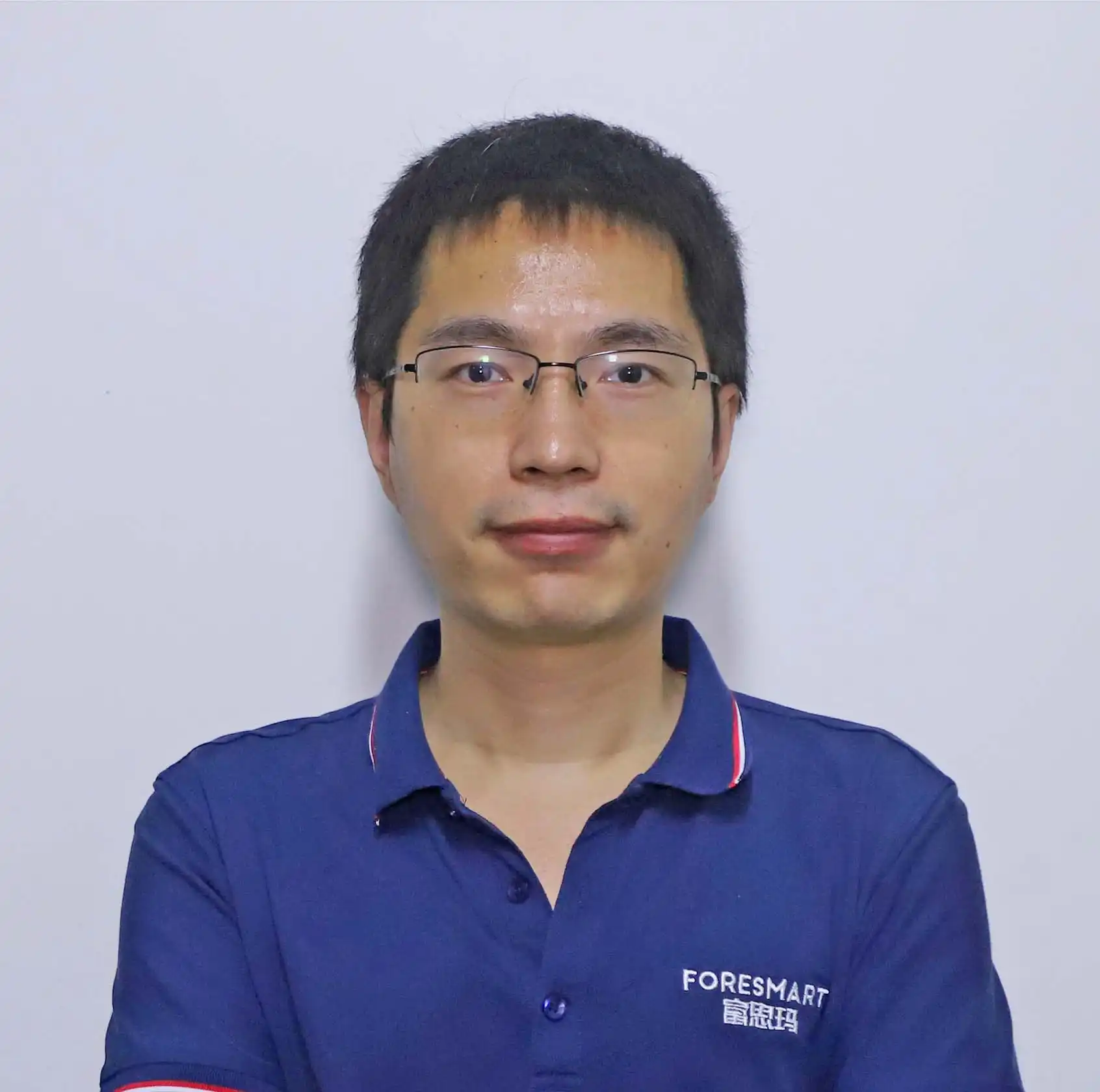
Photo verified by Foresmart
Robin Ren
Senior Manager at Foresmart
Focuses on global supply chains, Chinese export regulations, import compliance, customs brokerage, and professional cargo consolidation logistics.
About Robin Ren
About Robin
- Writes and updates guides on customs clearance procedures, ocean freight container specifications, air freight rates, and international shipping documents.
- Collaborates closely with **Foresmart compliance and operations** teams to ensure cargo transport plans align perfectly with bilateral customs policies.
- Managed over 500+ successful logistics shipments and optimized 12 crucial cargo consolidation processes in 2026.
Editorial & Review Process
Product Info Verified
Freight rates, ocean transit schedules, and aircraft cargo capacities are verified against official airline and shipping line schedules.
Compliance Approved
All import/export operational guides undergo legal reviews to comply with local customs clearance policies of both importing and exporting nations.
Operational Integrity
Technical blogs are updated quarterly in coordination with experienced warehouse and port supervisors to reflect real-world shipping conditions.
Published Articles by Robin Ren
Trade Terms
May 20, 2026
FOB Origin vs FOB Destination: Who Bears the Risk
An expert breakdown of risk transfer boundaries under UCC and Incoterms 2020 rules, helping importers prevent unexpected liability.
Read Full Guide
Trade Terms
April 12, 2026
Understanding DDP Shipping Terms and Rules
Detailed analysis of Delivered Duty Paid and Delivered at Place terms, analyzing customs clearance risks, duty payments, and tax management.
Read Full Guide
Customs Compliance
March 28, 2026
Customs Clearance Meaning and Process: A Guide for Importers
A practical guide to international customs processes, document requirements, and clearing cargo without customs-hold delays.
Read Full Guide
Customs Compliance
February 15, 2026
How Long Does Customs Take?
An operational roadmap analyzing port examination procedures, customs documentation audit durations, and strategies to prevent delays.
Read Full Guide